By Pat Valentine, PhD
Uyemura International Corporation
Southington CT
Abstract
Data independence and normality are underlying crucial assumptions for statistical process control charts. Understanding how to evaluate independence and normality before charting data is critical. Methods for checking data independence and normality are reviewed and provided with examples.
Keywords: data independence, data normality, statistical process control
Introduction
The most critical assumption made concerning statistical process control (SPC) charts is that of data independence from one observation to the next (free from autocorrelation) [1, 2]. The second critical assumption is that the individual observations are approximately normally distributed [1, 2]. The tabled constants used to calculate the SPC chart limits are constructed under the assumption of independence and normality.
Many printed circuit board chemical manufacturing processes can violate the assumption of data independence. This is because inertial elements drive reduction-oxidation (redox) chemical processes. When the interval between samples becomes small relative to the inertial elements, the sequential observations of the process will be correlated over time.
Statistical process control charts do not work well if the quality attributes charted exhibit even low levels of correlation over time. Correlated data produces too many false alarms–correlated data underestimates the upper and lower control limits.
Statistical process control charts are designed to capture 99.73% of the data within a +/- 3-sigma interval. In other words, there is a 0.9973 probability of not receiving a signal when the process is in control, the data is not autocorrelated, and normality is assumed. The distribution tails are symmetrical, each being 0.135% (100% - 99.73% = 0.27% / 2 = 0.135%). See Figure 1. Non-normal data changes the tail probabilities. Departures from normality can significantly alter SPC detection rules.
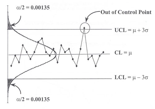
Figure 1. Symmetrical control chart.
Data Independence
There are two primary plots for checking data independence. These plots are the time series plot and the autocorrelation function plot. The time series plot is qualitative, while the autocorrelation function plot is quantitative. Details are given below.
Time Series Plot
Time series plots are an easy way to summarize a univariate data set graphically. Common assumptions of univariate data sets are that they have a fixed distribution, with a common location (mean) and common variation (standard deviation). With time series plots, shifts in location and variation are easy to see, and outliers can easily be detected, giving the process engineer an excellent feel for the data. Time series plots can answer the following questions:
- Is the data independent?
- Are there any shifts in location?
- Are there any shifts in variation?
- Are there any outliers?
Autocorrelation Function Plot
The autocorrelation function is used to detect independence in univariate data sets. The autocorrelation is a correlation coefficient. However, instead of a correlation between two variables, the correlation is between two values of the same variable at times Xi and Xi+k. Although the time variable, X, is not used in the formula for autocorrelation, the assumption is that the observations are equispaced [3, 4]. Usually, only the first few autocorrelations (lags 1, 2, & 3) are of interest in detecting independence. The autocorrelation function can be used to answer the following question:
- Was the sample data set generated from an independent (random) process?
Data Normality
There are two primary plots for checking data normality. These plots are the histogram and the probability plot. The histogram is qualitative, while the probability plot is quantitative. Details are given below.
Histogram. The most common form of the histogram is obtained by splitting the range of the data into equal-sized bins. Then, the number of data points that fall into each bin is counted. This allows the histogram to summarize the distribution of a univariate data set graphically. These summarizations provide strong indications of the proper distributional model for the data, in this case, the normal distribution for SPC charts [4]. The histogram can answer the following questions:
- What is the center of the data?
- What is the spread of the data?
- Are there any outliers?
- Are there multiple modes in the data?
- Is the data bell-shaped?
Probability Plot. The probability plot is a graphical technique for assessing whether or not a data set follows a given distribution [4]. The data are plotted against a theoretical distribution so that the points should form an approximately straight line on the diagonal. Departures from this straight line indicate departures from the specified distribution. The probability plot can answer the following questions:
- Does the normal distribution provide a good fit to the data?
- What are reasonable estimates for the location and variation parameters?
Examples
The process engineer gathers two data sets from the electroless nickel immersion gold final finish line. Data set one: the cleaner concentration (ml/L). Data set two: the micro-etch's sodium persulfate concentration (g/L). The assumptions of data independence and normality are checked. Data set one is shown in Figure 2, and two in Figure 3.
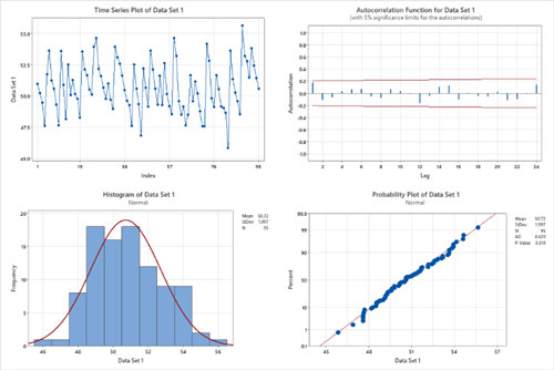
Figure 2. Data set 1: four-in-one data independence and normality plots.
Data Set One. The time series plot appears to have a fixed distribution, with a common location (mean) and common variation (standard deviation). There are no shifts in location or variation and no outliers. The autocorrelation function shows no statistically significant autocorrelations at lags 1, 2, or 3 (bars outside the red 95% confidence limit lines). The assumption of data independence has been met.
The histogram indicates that the data follows a normal distribution (a bell-shaped curve) and that there are no outliers. The probability plot points form an approximately straight line on the diagonal, and the p-value is significantly greater than 0.05. The assumption of data normality has been met.
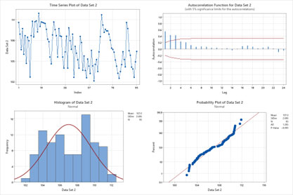
Figure 3. Data set two: four-in-one data independence and normality plots.
Data Set Two. The time series plot appears not to have a fixed distribution, and there is not a common location (mean) or common variation (standard deviation). There are shifts in the location and variation; no outliers are present. The autocorrelation function shows statistically significant autocorrelations at lags 1, 2, and 3 (bars outside the red 95% confidence limit lines). The assumption of data independence has been violated.
The histogram indicates that the data follows a bimodal distribution (two distinct peaks). The probability plot points do not form an approximately straight line on the diagonal, and the p-value is significantly less than 0.05. The assumption of data normality has been violated.
Statistical Process Control Charts
The two data sets were plotted on individual moving range SPC charts for discussion. Data set one is shown in Figure 4, and two in Figure 5, with the Western Electric Company Rules violation points in red. The four Western Electric Company Rules are listed below [4]
- 1 point more than 3 standard deviations from the center line
- 2 out of 3 points > 2 standard deviations from the center line (same side)
- 4 out of 5 points > 1 standard deviations from the center line (same side)
- 9 points in a row on the same side of the center line
All detection rules are subject to Type I false alarms (a point falling beyond the control limits, indicating an out-of-control condition when no assignable cause is present) [1, 4]. False alarm rates are reported as average run lengths (ARL). The ARL tells us, for a given situation, how long, on average, we will plot successive control chart points before we detect a rule violation. Using just the first Western Electric Company Rule provides an ARL of ~371. Using all four Western Electric Company Rules reduces the ARL to ~92. The process engineer has to decide whether this price is worth paying (signal sensitivity versus false alarms). One strategy is to use the four Western Electric Company Rules but take them "less seriously" regarding the effort put into troubleshooting activities when out-of-control signals occur.
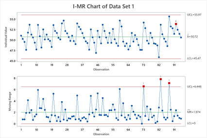
Figure 4. Data set one: individual moving range SPC chart.
Data Set One Discussion. The non-correlated data results in accurate upper and lower control limit estimations. The normal data provides the correct symmetrical tail probabilities. There are a few detection rule violations (points in red). The process engineer has reliable evidence that these rule violation points are out-of-control, not false alarms. The capability indices Cpk and Ppk should be computed. These capability indices will aid the process engineer in determining if the violation points are common causes or assignable causes.
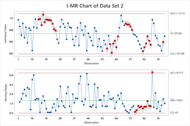
Figure 5. Data set two: individual moving range SPC chart.
Data Set Two Discussion. The correlated data results in underestimating the upper and lower control limits. The non-normal data changes the tail probabilities. There are many rule violations (points in red). The process engineer cannot determine which violation points are out-of-control or false alarms. The process engineer would waste valuable time investigating all of the violation points. The capability index Cpk would be misleading and is therefore not recommended to be computed. The capability index Ppk would be much more informative.
Conclusions
Data independence and normality are underlying crucial assumptions for statistical process control charts. Statistical process control charts do not work well if the quality attributes charted exhibit even low levels of correlation over time. Correlated data produces too many false alarms. Non-normal data alters the symmetrical tail probabilities. Violating independence and normality can significantly increase statistical process control detection rule false alarms. With a lack of data independence and normality, a process engineer has virtually no way of knowing which violation points are real and which are false alarms. Valuable time is wasted by not confirming the data's independence and normality before plotting it on a statistical process control chart.
References
[1] Montgomery, D. (2009). Introduction to Statistical Quality Control, 6th Ed. United States: John Wiley & Sons.
[2] Ryan, T. (2000). Statistical Methods for Quality Improvement, 2nd Ed. United States: John Wiley & Sons, Inc.
[3] Box, G. and Jenkins, G. (1976). Time Series Analysis: Forecasting and Control. Holden-Day.
[4] National Institute of Standards and Technology (2003). Handbook of Statistical Methods. NIST.
Biography
Patrick Valentine is the Technical and Lean Six Sigma Manager for Uyemura USA. He teaches Six Sigma Green Belt and black belt courses as part of his responsibilities. He holds a Doctorate in Quality Systems Management from Cambridge College and ASQ certifications as a Six Sigma Black Belt and Reliability Engineer. Patrick can be contacted at pvalentine@uyemura.com